30 May 2011

Storyboarding Recap Part 1

     My Storyboarding and Storytelling class consisted of two separate, concurrent projects. The Individual Project (IP) and the Discussion Board (DB). In this post, I will focus only on the DB project in order to make this project easier to follow.

     As an online class, the discussion boards seem to be an attempt at replacing or mimicking peer-to-peer interaction. In previous online classes I've taken it was also used for writing assignments that seemed to exist mostly to legitimize the course as an academic endeavor. Those previous classes would have a 1-2 page paper on a topic related to the IP and require research with footnotes and sources. In this case, it replaced the classroom participation but skipped the academic writing element in favor of more practical practice.

     The assignment for Unit 1 was to write a short story for a simple flash game. Every DB assignment afterward was based on this initial story. I think I switched between descriptive prose and simple statements a bit too much but I think it gets the main idea across. The short version is that a lower-class miner, named Ungrok, achieves his dream to become a leader when humans attack the mining camp and he's asked to lead the evacuation. That's the general intro leading into the rafting-themed navigation game. The 'full' version of the story is hidden below:

 » Click to Show/Hide the OrcRaft story « 

     In Unit 2, we were supposed to create a character design based on the main character from our Unit 1 story. I drew a couple pages of sketches to get the main idea down. Please disregard the creepy guy on the far right of the first sketch, he's an early version of my character for the IP project that I'll go over in part two. The original pose was meant to illustrate his leadership role by the way he's pointing. It was a bit unnatural so I dropped his arm to the side in the final version. I think the way he stands on the rock and remains forward-focused helps to portray at least some small glimmer of leadership in a more relaxed and natural way.
Unit 2 - Discussion Board - Sketches 1 - 6 May 2011

Unit 2 - Discussion Board - Sketches 2 - 6 May 2011

Unit 2 - Discussion Board - Character: Ungrok - 8 May 2011

     Starting in Unit 3, the DB project deviated from 'Storyboarding and Storytelling' and became part of a series of courses working toward the same project for students following the Online-only curriculum. The DB for this class is intended to be the foundation or head-start for the IP in Interface Design, even though the on-campus courses are taken in exactly the opposite order. In any case, the assignment in Unit 3 was to draw the environment for our flash game. Having already taken Interface Design, I had a good idea of what needed to be drawn. However, I used this assignment as an opportunity to create an extended level design and explore ways to really push some variety into the game play.

Unit 3 - Discussion Board - OrcRaft Environment - 11 May 2011

     In Unit 4, we had to draw a Prop Sheet to conceptualize the in-game assets required to build the game 'in future classes'. This time around, I simply drew many of the assets I had already built in Interface Design. I couldn't think of a way to push the designs much further. I think I drew a much better fish this time around, though.
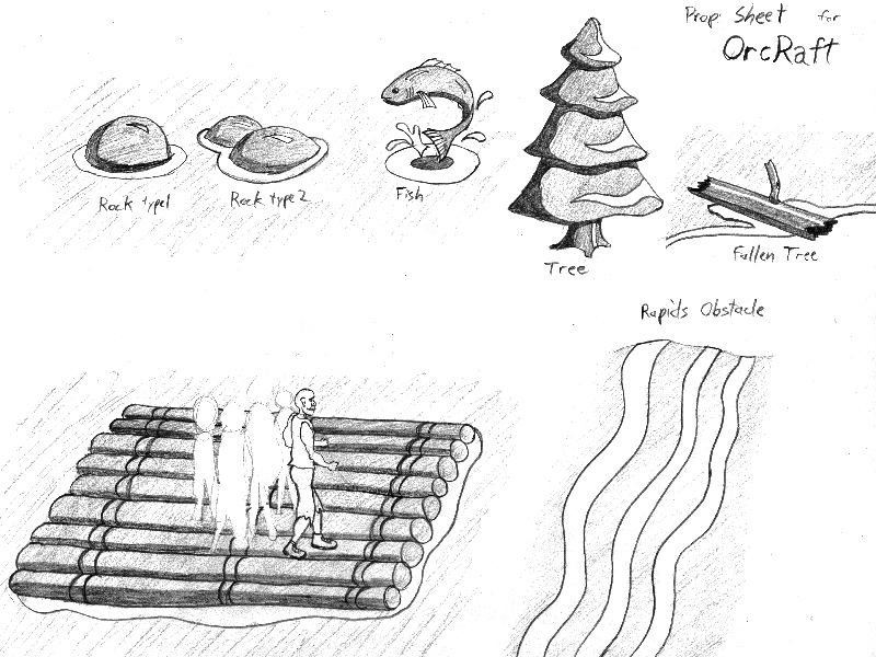
Unit 4 - Discussion Board - OrcRaft Prop Sheet - 18 May 2011

     Finally, in Unit 5, we were supposed to design the interface for our casual game idea. I found my first design to be pretty simple and streamlined, though a bit plain. So, I redesigned it for this assignment. I wanted to add an actual fraction to make it easier to see exactly how many Orcs are left on the raft without needing to count. I like the addition of the progress bar in the upper right corner. It's not an actual map of the level, just an indication of how much distance is left in the current level.

Unit 5 - Discussion Board - Interface Design - 25 May 2011

     That's all there was to the Discussion Board half of my Storyboarding class. I was thankful that it felt less like busywork and jumping through hoops, even though I was forced to revisit something that was already 'finished'. There is always room for improvement and that certainly held true in this case. I think these assignments helped me to refine my vision for the game.

29 April 2011

Interface Design Recap

Here is a quick overview of my five-week-long online course on Interface Design:
Week 1
       Learning to use Illustrator. Create a scene with three buildings on a street corner using proper perspective. I used vanishing points and lines on a construction layer for the brick and concrete building outlines. For the brick pattern, I used the perspective tool in CS5. For the house in the distance, I used the pen tool to traced portions of a photograph I found online, with some modifications and omissions. Other than that, it's just a lot of gradients and simple shapes using the pen tool.
Unit 1 - Individual Project - 27 March 2011
Week 2
       More advanced practice with Illustrator. We were asked to trace a somewhat pixelated black & white image of a Japanese pagoda-style bridge. It was mostly about using the pen tool properly and experimenting with various effects. I used multiple layers of transparency for the shrub on the left. The water was made using around seven copies of the same shape, set to low opacity, with the same radial gradient in a different position on each. I was trying to simulate the interplay of multiple ripples in water and I think it ended up being an effective technique.
Unit 2 - Individual Project - 3 April 2011
Week 3
       Interface design for a role-playing game. We had a lot of freedom on this one. It was just a matter of creating an effective on-screen interface for a hypothetical RPG. The concept I came up with was a wizard focused RPG where, instead of choosing a class, you choose a school of magic to focus on. I started with the wizard, staff, and lightning before starting the background.
       My initial idea was some sort of dungeon or castle interior but my wife suggested some mountains. I figured I'd give it a shot. The mountains looked alright but it wasn't a very good background, so I knew I needed a mid-ground filler. The dark forest really helped out. My teacher made a good observation that the perspective and detail of the trees is lacking. It could definitely use a bit of work.
       The interface itself is pretty straightforward. The health bar is green and additional lives are represented by potion bottles, with spots for two more as your character gains power. Mana works in a similar way. I used a red bar around the character portrait to track progress toward the next level. Since it is a half circle, it could be a simple object rotation in the code to fill the bar. A spell book as the menu system, inventory, and quest journal is a bit of an obvious choice, if a little cliche.
Unit 3 - Individual Project -10 April 2011

Week 4
       Discussion board assignment to make a flow chart of the main menu interface for your favorite game. It was just a matter of documenting how the menus link together and adding a little color to keep it interesting. I left out some of the 'minor' or repetitive menus for the sake of space. I think the intent of the assignment was to get students to think about the planning involved in the menu system for AAA titles.
Unit 4 - Discussion Board - Elder Scrolls IV: Oblivion
       The Individual Project for week 4 was to create a flow chart for our casual game concept. The intent, for students who take most courses online instead of on campus, is to design the interface for a game that will be created over a series of classes. I got a bit ahead of myself on the graphics, since this was just supposed to be a simple flow chart concept.
       I created a custom font for the logo. I started by choosing 2-3 fonts I liked, converted them to outlines, and began to mix and match (or simply overlap) elements into something I liked. Then I froze them on a layer and traced over top, adding the curves and points to my liking. I made sure to have a few guidelines in the background while working but I probably could have used a few more.
Unit 4 - Individual Project -17 April 2011
Week 5
     The discussion board was to post your logo and Unit 4 flow chart for discussion. I received several nice compliments but no constructive criticism. I do like how it turned out but I know it's not perfect. Any critiques would be appreciated. Perhaps the interface is too simplistic? I could call it sleek and easy to read but I could also call it plain and boring.
Unit 5 - Discussion Board - OrcRaft Logo - 17 April 2011
Unit 5 - Discussion Board - OrcRaft game play - 17 April 2011
       The individual project was to create a poster for the game (80s style) using finished versions of the screens depicted in our flow chart. Since I went overboard on the graphics during the 'flow chart', there wasn't a whole lot to change before adding it to the poster layout. This might have resulted in a more detailed composition than the assignment technically called for... but who's to say I wouldn't have done this much with it anyway?
Unit 5 - Individual Project - OrcRaft Poster - 23 April 2011
       I definitely learned a lot about Illustrator in this course, since I haven't opened the program in over a decade. I think I was introduced to it back in my freshman year of high school, circa 1997, though I may have used it a few times for basic layout & printing at Lawrence Tech. I think I learned a few things about interface design during the past 5 weeks. One would hope so. You always learn a lot by doing but I would have liked to go a little more in-depth into psychological and usability issues involved in good design. The class barely scratched the surface, really, but that's not unexpected given the nature of this program.

.....and I just posted another extremely long post. Oh well, it was worth it.

25 April 2011

Term 5 Midterm

It sure didn't take long to completely destroy my intended schedule. Part of my problem so far seems to have been that I like to make long, intricately composed posts. I've also had the intention of working through my backlog of completed projects in order to keep things somewhat 'in order'. So, I'll need to worry a lot less about those things and with posting exactly once a week, rather than just posting whenever I have time. Eventually, I'll run out of past projects and have to post exclusively about current projects. I might as well get straight into it.

This term I'm taking an on-campus 10 week Scripting 2 class, I just finished a 5 week online class for Interface Design, and, in a few more minutes, I'm starting a 5 week online class for Storyboarding and Storytelling.

The first few weeks of Scripting 2 was a general recap of Scripting 1 but we quickly bypassed the old material and got into more challenging work. We're using Flash CS5 this term. In Scripting 1 we coded everything on the time line but now we're learning to do it properly and trying to wrap our heads around the hierarchy of classes, public & private functions, and separate Action Script files, among other things. Our current project, the last one before our final project begins, is a bit of animation and character movement functions. Here is the character I came up with and animated, called Centasaurus Rex:

Once the final project kicks in, I'll follow the process week to week, as much as possible.

I think I'll make a separate post about Interface design later on.

Edit: I had to fix the date. It was set to 17 April, when I first saved a draft related to my tardy posts.

27 March 2011

Modeling 1 Recap

The main project for Modeling 1 was a corner scene with a polygon limit of 3000 and a max pixel size of 2048x2048 for all textures, combined. I decided to create a warehouse scene. The concept story was that a thief had broken into this old warehouse in search of valuable artifacts. He was frightened by what he found and left behind some of the tools of his trade in the process.

I began with the corner of the warehouse, some storage racks, a crate, and a wood pallet. The flashlight is just a placeholder at this point. I was playing around with some overhead lighting and shadows with this version.

Warehouse Render - Version 01 - 14 August 2010

I then added the steel frame of the building and began creating the textures. I realized early on that the crate with the main artifact would need to be much closer to the camera if it was going to be an effective focal point. I intentionally kept the lighting dark, in an effort to hold a strong focus but the overall scene is almost unreadable this way.

Warehouse Render - Version 04 - 28 August 2010

I brightened up the scene a bit in this version. I also added a pallet jack, a crow bar, and a mask. It took quite a while to decide on the mask as an artifact but it ended up being an effective choice, in my opinion. I used a segmented box and edited the vertices to match a photograph of a mask I found online. A mirrored instance allowed me to keep the mask symmetrical throughout the process. I think it turned out well for one of the first complex, semi-humanoid forms I've modeled.

Warehouse Render - Version 07 - 11 September 2010

The distance of the crate and mask still needed major adjustment in order to bring out the appropriate level of detail. It became a much more interesting composition with the mask and crate just off center. Illumination and volume fog from an emergency light was used to help balance the composition.

Warehouse Render - Version 11 - 01 October 2010

The rest of the textures were finished and applied. Lighting adjustments were made, both in 3D Studio and in Photoshop (for the sake of printing), to make the image more easy to read. The result is an early morning shot of the warehouse after the failed late-night burglary.

Warehouse Render - Final - 03 October 2010

I'm pretty happy with the results of this project. The final poly count was 2320 and the final tris were 4214. I don't actually remember the final texture size but I know I had room to spare. Opacity, Specular, and Bump maps were not counted in addition to the matching diffuse maps involved.

There are a few things I might have changed or done differently, now that I'm more experienced, but I'm happy with it for what it was. For screen viewing, rather than printing purposes, I'd actually prefer a blend between the Final Render and version 11, as far as the brightness of the lighting.

I'll end with a dough-boy render of the final with wireframes:
Warehouse Render - Final Dough-boy - 03 October 2010

20 March 2011

hello, world

Everything must start somewhere. This blog starts here, without any particular temporal significance and no grander reason than the idea that it will have to happen eventually.

My name is Michael Derry. I'm just another unique mind among billions of others looking to make a positive impact on the world during my short journey through it. For as long as I can remember, I wanted to be an Architect. In High School I took some architecture & drafting classes and a few 3D modeling classes. I did pretty well in the Technology Fair for 3D animation but I went on to study Architecture as planned.

I did pretty well through most of it, struggling only through the heavy calculations of statics/structures, and graduated with a Bachelor of Science in Architecture. Designing buildings, public spaces, and human interactions with the built environment were all interesting and enjoyable experiences but eventually I had to step into the real world. I loved design studios and the ideal of what an Architect is supposed to be but the realities of what an Architect really is began to wear on me before I even graduated.

To make a long story slightly shorter, with a degree in hand I still had five years and tens of thousands of dollars between myself and a license. Since the true nature of the job was nothing like the brochures, my passion quickly faded and I began to prepare myself for a long an boring career ahead. I never lost my interest in creating and designing but realized that I had been tricked into a field with few opportunities for true creative expression. In a declining economy, it also had few opportunities for employment.

As I trudged along at my job in an 'Architecture office' that specializes in adding antennas to cell towers, I bounced around to different creative projects in my free time. I spent several months immersed in the idea of Seasteading and came up with a complex structural design for a single family home on the open ocean. I then started creating mods for The Elder Scrolls IV: Oblivion. It was a great experience that I thoroughly enjoyed. I thought of it as nothing more than a fun hobby until I realized that Game Design is a real job and people can do this for a living.

Several months after this realization set in, I started to take the idea seriously. I researched what the job(s) involves, local schools, and the skill sets required. Art, design, and technical computer knowledge are some of the important skills that I just happen to be strong in. Instead of creating office buildings, I could create worlds. Instead of drawing equipment layout plans, I could draw concept art and build 3D models. Even if I'm the lowest ranking grunt in the office and I make dozens of repetitive clutter objects a day, I'd still be creating useful works of art and have a chance to sit in on the occasional development meeting and support the team with my great ideas.

I'm not naive enough to believe the hype in the ads for all the for-profit game design schools. I know you don't make games using XBox 360 controllers and it's not some easy, glamorous job that any slacker could do. Maybe my vision of being able to have input in the development process isn't realistic. Only time will tell. However, I have pretty strong hope that I've found a much better career fit for myself in Video Game Design.

This blog will mostly be a place where I talk about the process of getting through school and eventually looking for a job. I'll talk about the projects I'm working on and the process I go through to create and refine them. My only goal is to update consistently. For now, I'm aiming for once a week. Let's see if I can do it.